
In the previous article Navigation within Apps I’ve shown a few variants how Windows appls build up their menus. In this article I’m showing how this can be done using XAML.

Hamburger Button
The Hamburger button is known by many users to be a menu of pages or options. Thus, it is now often used by Windows apps as well.
The icon of the Hamburger button was designed by Norm Cox for the Xerox Star user interface. Who designed the Hamburger icon?
The functionality of a Hamburger button is typically the one of a ToggleButton, so this can be used. How to get the Hamburger graphic to this button? The Segoe MDL2 Assets font offers a huge range of icons, one of these is the icon for the Hamburger button: U+E700.

I miss resize functionality of the Character Map desktop application that is included with Windows. I thought about it’s not too hard to create one on my own, but before I did I checked the Windows Store. And indeed, there are several apps with the functionality of the desktop application. I’m now using Character Map UWP with a nice UI. There are many other apps with similar functionality. Just a note: I didn’t compare the functionality of the different available apps and just selected one that matched my needs. In case you compared them and found the best one, please add a comment.

Defining a simple style of the button, the Content and FontFamily properties need to be set:
<Style x:Key="HamburgerButtonStyle" TargetType="ToggleButton">
<Setter Property="Content" Value="" />
<Setter Property="FontFamily" Value="Segoe MDL2 Assets" />
<Setter Property="FontSize" Value="20" />
<Setter Property="MinHeight" Value="48" />
<Setter Property="MinWidth" Value="48" />
</Style>
The button itself references the HamburgerButtonStyle:
<ToggleButton x:Name="HamburgerButton" Style="{StaticResource HamburgerButtonStyle}" Visibility="Collapsed" />
Split View
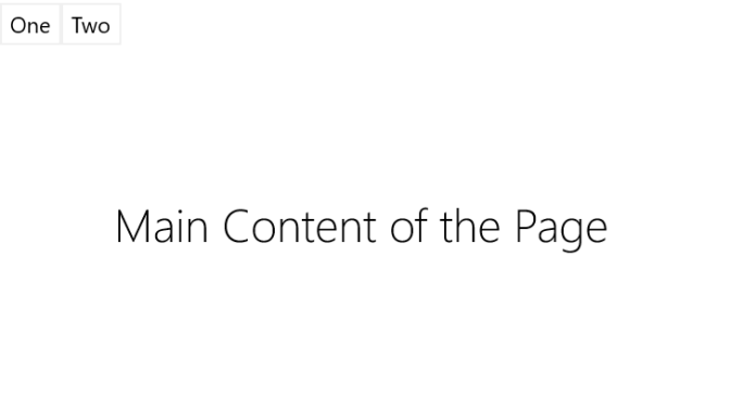
The main content of the Window will be available within a SplitView. The SplitView should open its pane that contains menu entries when the Hamburger button gets clicked. Just look at the binding of the IsPaneOpen property. This property binds to the IsChecked property of the ToggleButton.
<SplitView Grid.Row="1"
           DisplayMode="Inline"
           OpenPaneLength="240"
           IsPaneOpen="{x:Bind HamburgerButton.IsChecked, Mode=TwoWay, Converter={StaticResource NullableBoolConverter}}">
    <SplitView.Pane>
        <StackPanel Orientation="Vertical">
            <Button Content="One" Style="{StaticResource MenuButtonStyle}" />
            <Button Content="Two" Style="{StaticResource MenuButtonStyle}" />
        </StackPanel>
    </SplitView.Pane>
    <TextBlock Text="Main Content of the Page" Style="{StaticResource HeaderTextBlockStyle}" HorizontalAlignment="Center" VerticalAlignment="Center" />
</SplitView>
Using the Windows 10 Anniversary Update, bool to Visibility converters are no longer required with compiled bindings. However, here a bool to a bool? type is bound – and this requires a converter (IValueConverter).
This is all what’s needed to activate this functionality. Clicking the button opens the pane of the SplitView and thus the two menu buttons defined within the Pane are shown. Clicking the button again, the pane closes.


Display Modes of the SplitView
The SplitView offers four different display modes of type SplitViewDisplayMode. The mode Inline does not hide the content but instead resizes the content area to exclude the size of the pane. The mode Overlay does not resize the content, and moves the pane over the content. The other two modes belong to the Compact category and offer similar functionality: CompactOverlay and CompactInline. With the compact modes, a small compact area of the SplitView is automatically opened. Usually this area is used to just display icons of the menus. The size of the compact area is defined by the CompactPaneLength property. When the pane is opened, the pane opens to the larger size ddefined by the OpenPaneLength property.
Adaptive Trigger
Depending on the Window size, either a larger menu should be shown on top, or the Hamburger button with the menus in the SplitView pane. This functionality is offered by the adaptive trigger. The following code snippet changes the visibility of the horizontal menu and the Hamburger button depending on Window sizes 320 and 720.
<VisualStateManager.VisualStateGroups>
    <VisualStateGroup>
        <VisualState x:Name="MediumState">
            <VisualState.StateTriggers>
                <AdaptiveTrigger MinWindowWidth="720" />
            </VisualState.StateTriggers>
            <VisualState.Setters>
                <Setter Target="HorizontalMenu.Visibility" Value="Visible" />
                <Setter Target="HamburgerButton.Visibility" Value="Collapsed" />
            </VisualState.Setters>
        </VisualState>
        <VisualState x:Name="XSmallState">
            <VisualState.StateTriggers>
               <AdaptiveTrigger MinWindowWidth="320" />
            </VisualState.StateTriggers>
            <VisualState.Setters>
                <Setter Target="HamburgerButton.Visibility" Value="Visible" />
            </VisualState.Setters>
        </VisualState>
    </VisualStateGroup>
</VisualStateManager.VisualStateGroups>
Typical triggers for the Window sizes are 320, 548, 720, and 1024.
The menu for the larger Window is just defined within a StackPanel:
<StackPanel x:DeferLoadStrategy="Lazy" x:Name="HorizontalMenu" Orientation="Horizontal" Visibility="Collapsed">
    <Button Content="One" Style="{StaticResource MenuButtonStyle}" />
    <Button Content="Two" Style="{StaticResource MenuButtonStyle}" />
</StackPanel>
Running the application, depending on the Window size you can either see the larger menus, or the Hamburger button.

Defer Loading Strategy
Having XAML elements loaded in the tree needs resources, no matter if the elements are visible or collapsed. Using the Live Visual Tree feature of Visual Studio while debugging the application, you can see the elements loaded. To avoid loading the elements to the tree at startup time, the x:DeferLoadStrategy can be set. This loads the elements only when the elements are accessed, or the method FindName is invoked. With the sample coe, the menu that is only shown with the larger Window is not loaded into the visual tree if the application is started with a smaller Window. The StackPanel containing the menus is only loaded when the Window is resized to at least 720 pixels.
Summary
No matter if the application is running on the Windows Phone, or you use smaller and larger Windows on the desktop, the functionality is the same. Using SplitView and AdaptiveTrigger, as well as the Segoe MDL2 Assets font for using icons such as the Hamburger glyph make it easy to offer adaptive layouts for the UWP app.
Sample code is available on GitHub.
More Information
Also check my presentation and code samples for Adaptive Layouts presentation.
More information about XAML and UWP apps is available in my new book Professional C# 6 and .NET Core 1.0.
I’m offering workshops covering the Universal Windows Platform as well. Ask for a customized workshop adapted to your needs.
Hamburger © Nevodka | Dreamstime.com Hamburger
 blogs.cninnovation.com
One thought on “Hamburger Button and SplitView”