
In part 2 of this article series I’ve shown using the Desktop Bridge – using Windows Runtime APIs and integrating communication with UWP applications with WPF. One limitation of the desktop bridge is that new UWP controls can’t be used directly in the WPF application. Using the desktop bridge, new user interface features are used with the UWP application, and communication is done between the WPF and the UWP application using app services. This all has been shown in the previous article.
Another integration level is offered with XAML Islands. Here, the new UWP controls can be directly used with the WPF application – running in the same process on the same thread. This article gives you more information about features and issues on using XAML Islands.

UWP XAML Hosting API
Starting with the Windows 10 October 2018 update (build 17763), Windows 10 offers a new API – the UWP XAML hosting API. This API can be used in desktop applications and allows to associate UWP XAML controls with window handles (HWND). This makes it possible to use UWP controls with Win32 applications, e.g. native C++ applications as well as WPF and Windows Forms applications.
Be aware that with the Windows 10 October 2018 update, this API is in developer preview and not recommended to be used in production.
The class WindowsXamlManager allows to initialize the current thread to host UWP controls (InitializeForCurrentThread). The class DesktopWindowXamlSource is then used for hosting the controls. To the Content property, a Windows.UI.Xaml.UIElement derived class can be assigned to. This class then allows setting the focus, and receiving focus events.
An important WPF class in this scenario is the HwndHost class. This class is a WPF FrameworkElement (derives from the base class FrameworkElement), and allows to host a Window in a WPF application. This class is available since the first version of WPF – starting with .NET Framework 3.0.
Windows Forms and WPF had a similar interop scenario. You can host Windows Forms controls in WPF, and the other way around – WPF controls in Windows Forms apps. Here, the restriction is the airspace: one pixel – one technology. You can’t have a transparent WPF control and let Windows Forms shine-through. This way, you also can’t use non-rectangular controls. The same restriction applies now hosting UWP controls in WPF applications.
Enhancing WPF applications, there’s no need to use this API directly. Instead, you can use the features wrapped controls and host controls which are part of the Windows Community Toolkit.
Windows Community Toolkit
Wrappers to UWP controls that can be used directly with a WPF application can be found in the Windows Community Toolkit (the NuGet package has the name Microsoft.Toolkit), previously known as UWP Community Toolkit. This toolkit was first developed to create additional controls for UWP applications. Because of its change to also support WPF and Windows Forms applications, the name was changed from UWP Community Toolkit to Windows Community Toolkit. The name of the packages start with Microsoft.Toolkit. The packages offering support for WPF applications, are listed here:
- Microsoft.Toolkit.Wpf.UI.Controls
- Microsoft.Toolkit.Wpf.UI.Controls.WebView
- Microsoft.Toolkit.Wpf.UI.XamlHost
The Controls package includes wrapper controls for inking including InkCanvas, InkToolbar, several ink button controls for the toolbar, and the MediaPlayerElement to play videos. The WebView package contains the WebView class which makes use of Microsoft Edge running on Windows 10. This package also includes WebViewCompatible. WebViewCompatible supports more versions of the Windows platform: using this control with Windows 10 devices, it uses the rendering engine of Microsoft Edge. On older Windows systems, Internet Explorer‘s engine is used.
The XamlHost package is the foundation used by the other packages – and it allows you to host other UWP controls in WPF.
To access the Windows API from UWP you also need to reference the Windows Runtime APIs as shown in Enhance your desktop application for Windows 10.
Wrapped Controls
Let’s start with wrapped controls – controls that are built for WPF and access UWP controls behind the scenes. One of these controls is the WebView control – available in the namespace Microsoft.ToolKit.Wpf.UI.Controls. For using this control within XAML code, the namespace together with the assembly needs to be added to the XML declaration to map the .NET namespace to XML. This can easily be done using the Visual Studio toolbox and moving the controls to the XAML code. As soon, as the NuGet packages are added, the controls show up in the toolbox.
Web View
Adding references to the NuGet packages, the WebView can be used as shown in the following code snippet.
This file contains hidden or bidirectional Unicode text that may be interpreted or compiled differently than what appears below. To review, open the file in an editor that reveals hidden Unicode characters.
Learn more about bidirectional Unicode characters
| <toolkit:WebView Grid.Row="1" | |
| x:Name="webView1" | |
| Source="https://csharp.christiannagel.com" | |
| Margin="4" | |
| IsJavaScriptEnabled="True" | |
| IsIndexedDBEnabled="True" | |
| IsScriptNotifyAllowed="True" | |
| Loaded="WebView_Loaded" /> |
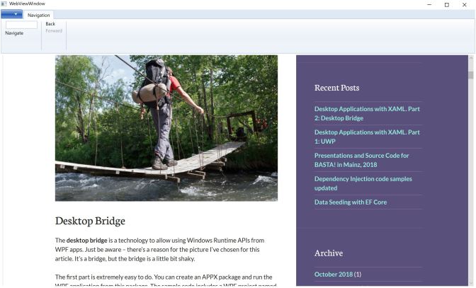
The sample application also includes a Ribbon control that’s used to navigate with the WebView. Commands map to handler methods, and the methods access the WebView control for the navigation.
This file contains hidden or bidirectional Unicode text that may be interpreted or compiled differently than what appears below. To review, open the file in an editor that reveals hidden Unicode characters.
Learn more about bidirectional Unicode characters
| private void WebView_Loaded(object sender, RoutedEventArgs e) | |
| { | |
| if (sender is WebView webView) | |
| { | |
| webView.NavigationCompleted += (sender1, e1) => CommandManager.InvalidateRequerySuggested(); | |
| } | |
| } | |
| private void OnGoToPage(object sender, ExecutedRoutedEventArgs e) | |
| { | |
| try | |
| { | |
| webView1.Navigate(textUrl.Text); | |
| } | |
| catch (Exception ex) | |
| { | |
| MessageBox.Show(ex.Message, "Error"); | |
| } | |
| } | |
| private void OnBrowseBack(object sender, ExecutedRoutedEventArgs e) => | |
| webView1.GoBack(); | |
| private void OnBrowseForward(object sender, ExecutedRoutedEventArgs e) => | |
| webView1.GoForward(); | |
| private void CanBrowseForward(object sender, CanExecuteRoutedEventArgs e) => | |
| e.CanExecute = webView1?.CanGoForward ?? false; | |
| private void CanBrowseBack(object sender, CanExecuteRoutedEventArgs e) => | |
| e.CanExecute = webView1?.CanGoBack ?? false; |
The sample application with the Ribbon control and the Web View is shown here:
Ink
Other wrapped control are InkToolbar and InkCanvas. The canvas allows to draw ink while the toolbar control offers selecting pen, pencil, highlighter, eraser, and a ruler. The toolbar is connected to the canvas setting the TargetInkCanvas property.
This file contains hidden or bidirectional Unicode text that may be interpreted or compiled differently than what appears below. To review, open the file in an editor that reveals hidden Unicode characters.
Learn more about bidirectional Unicode characters
| <toolkit:InkToolbar | |
| TargetInkCanvas="{x:Reference inkCanvas}" | |
| Grid.Row="0" | |
| Height="150" /> | |
| <toolkit:InkCanvas | |
| x:Name="inkCanvas" | |
| HorizontalAlignment="Left" | |
| Margin="8" | |
| VerticalAlignment="Top" | |
| Grid.Row="1" | |
| Loaded="OnInkLoaded"/> |
To draw not only with a pen, but also with mouse and touch, the InputDeviceTypes property of the InkPresenter can be configured for the enum values Mouse, Pen, and Touch. The InkPresenter as well as the CoreInputDeviceTypes enum has been wrapped with WPF classes.
This file contains hidden or bidirectional Unicode text that may be interpreted or compiled differently than what appears below. To review, open the file in an editor that reveals hidden Unicode characters.
Learn more about bidirectional Unicode characters
| private void OnInkLoaded(object sender, RoutedEventArgs e) | |
| { | |
| if (sender is Toolkit.InkCanvas) | |
| { | |
| inkCanvas.InkPresenter.InputDeviceTypes = CoreInputDeviceTypes.Mouse | CoreInputDeviceTypes.Pen | CoreInputDeviceTypes.Touch; | |
| } | |
| } |
Running the application, you can select pen, pencil, and the highlighter to draw an image into the canvas. The ruler helps drawing straight lines.

Map
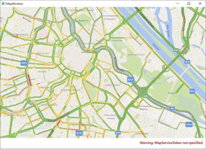
The wrapped MapControl makes use of the UWP MapControl. This control offers maps with different styles such as aerial, terrain, and road styles, offers street views, and can show landmarks and traffic information.
Using the
MapControlwith UWP Apps is covered in the downloadable bonus chapter More Windows Apps Features from my book Professional C# 7 and .NET Core 2.0.
With the XAML code using the MapControl, properties such as DesiredPitch, ZoomLevel, and LandmarksVisible are set.
This file contains hidden or bidirectional Unicode text that may be interpreted or compiled differently than what appears below. To review, open the file in an editor that reveals hidden Unicode characters.
Learn more about bidirectional Unicode characters
| <toolkit:MapControl | |
| DesiredPitch="20" | |
| ZoomLevel="14" | |
| LandmarksVisible="True" | |
| TrafficFlowVisible="True" | |
| PedestrianFeaturesVisible="True" | |
| Loaded="OnLoadedMap" /> |
The position of the map is set in the code-behind invoking the method TrySetViewAsync method of the MapControl.
This file contains hidden or bidirectional Unicode text that may be interpreted or compiled differently than what appears below. To review, open the file in an editor that reveals hidden Unicode characters.
Learn more about bidirectional Unicode characters
| private async void OnLoadedMap(object sender, RoutedEventArgs e) | |
| { | |
| if (sender is Toolkit.MapControl mapControl) | |
| { | |
| var point = new Interop.Geopoint(new Interop.BasicGeoposition { Latitude = 48.2, Longitude = 16.3}); | |
| bool result = await mapControl.TrySetViewAsync(point); | |
| } | |
| } |
An alternative to use the UWP MapControl is to use the new Azure Maps Map Control. This can be used with HTML pages – with WPF, the wrapped
WebViewcan be used to host this control.
Host Controls
Instead of using the predefined wrapped controls, you can host other controls. The sample application makes use of the UWP Button class.
The WindowsXamlHost class (in the namespace Microsoft.Toolkit.Wpf.UI.XamlHost and the package Microsoft.Toolkit.Wpf.UI.XamlHost) hosts a UWP control by setting the InitialTypeName property to the name of the UWP class.
This file contains hidden or bidirectional Unicode text that may be interpreted or compiled differently than what appears below. To review, open the file in an editor that reveals hidden Unicode characters.
Learn more about bidirectional Unicode characters
| <xamlHost:WindowsXamlHost | |
| . x:Name="MyXamlHost" | |
| Height="200" | |
| Width="400" | |
| Margin="20" | |
| VerticalAlignment="Top" | |
| InitialTypeName="Windows.UI.Xaml.Controls.Button" | |
| ChildChanged="OnHostChildChanged"/> |
To access the underlying UWP control, a handler to the ChildChanged event can be defined. The Child property of the WindowsXamlHost is of type Windows.UI.Xaml.UIElement. This returns the UWP control, with is a Windows.UI.Xaml.Controls.Button with the code sample. This can now be used to access the members of the button, such as setting the Content property and a handler for the Click event.
This file contains hidden or bidirectional Unicode text that may be interpreted or compiled differently than what appears below. To review, open the file in an editor that reveals hidden Unicode characters.
Learn more about bidirectional Unicode characters
| private void OnHostChildChanged(object sender, EventArgs e) | |
| { | |
| if (sender is WindowsXamlHost host && host.Child is UWPControls.Button button) | |
| { | |
| button.Content = "My UWP Button"; | |
| button.Click += (sender1, e1) => | |
| { | |
| MessageBox.Show("UWP button clicked"); | |
| }; | |
| } | |
| } |
Summary
Compared to the desktop bridge, the XAML Island offers another integration level: you can use UWP controls within WPF applications. You can enhance existing WPF applications with new controls available with the UWP platform, and make use of new design features. The best way to create new desktop applications nowadays is using the Universal Windows Platform. Using the XAML Island allows enhancing your WPF application with new Windows 10 features.
An even better integration is coming with .NET Core 3.0 which allows enhancing WPF applications with new features from .NET Core – which also will support XAML islands.
In case you would like to enhance your WPF applications now – go ahead and use Windows Runtime APIs with the help of the desktop bridge.
If this information motivated you enhancing your WPF applications with UWP features, consider buying me a coffee which helps me staying up longer and writing more articles.

More information on XAML and writing UWP applications is in my book Professional C# 7 and .NET Core 2.0, and in my Programming Windows Apps workshops.
Enjoy learning and programming!
Christian
Links
Desktop Applications with XAML. Part 1: UWP
Desktop Applications with XAML. Part2: Desktop Bridge
Desktop Applications with XAML. Part 3: XAML Islands
GitHub repository for the Windows Community Toolkit
Current issues with XAML islands
Microsoft Docs – Using the UWP XAML hosting API in a desktop application
Microsoft Docs – UWP Controls in Desktop Applications
Microsoft Docs – Windows UI Xaml Hosting
Bonus Chapter – More Windows Apps Features
.NET Framework 4.8 Early Access
Microsoft Build Video – Modernizing Desktop Apps on Windows 10 with .NET Core 3.0 and much more
Photo ID 20981947 Maldives island panorama with sun shining © Totophotos from Dreamstime
 blogs.cninnovation.com
3 thoughts on “Desktop Applications with XAML. Part 3: XAML Islands”